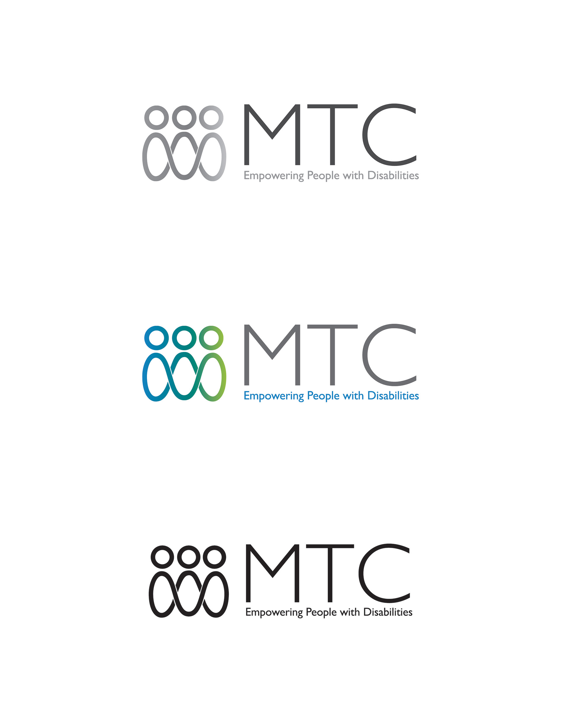
MacDonald Training Center enlisted my services to create a new logo for their organization, which takes an integrated approach to improving the lives of people with disabilities. They wanted the new logo to communicate a sense of "togetherness", that was part of their old logo. They also wanted to switch to using their initials, because the MacDonald name caused confusion (there is no relationship with MacDonald House Charities or a fast food chain). They do not feel that "Training Center" accurately represents the work that they do any longer.
A lemniscate is a sideways figure-eight shape that has come to be known as a symbol representing infinity. Recently, it has also come to indicate inclusion/inclusivity. The symbol for inclusion seemedvery fitting for MTC's identity. I have extended this symbol to create a minimalist group of three connected people.
A lemniscate is a sideways figure-eight shape that has come to be known as a symbol representing infinity. Recently, it has also come to indicate inclusion/inclusivity. The symbol for inclusion seemedvery fitting for MTC's identity. I have extended this symbol to create a minimalist group of three connected people.
I have added a yellow-green to MTC's existing color palette. The gradient and clean, sweepinglines give this logo mark a modern feel.
I chose a sans-serif font with a very circular letter "C", which looks stylistically
consistent with the circular heads in the logo mark. The type is colored very dark gray, and MTC's existing blue, to create visual balance and contrast. I took this approach because high contrast, sans-seriffonts are most readable for people who have impaired vision.
consistent with the circular heads in the logo mark. The type is colored very dark gray, and MTC's existing blue, to create visual balance and contrast. I took this approach because high contrast, sans-seriffonts are most readable for people who have impaired vision.